Over the past week I’ve been playing with Mailbox, so I figured it might be a good candidate for my first product review on product thursday.
The main assumption behind Mailbox is that most people tend to view their inbox as a to-do list. Though I’ve tried to shed that assumption in my own use of Gmail, it’s been hard. Mailbox is a welcome addition and really reduces the need for me to spend time on actively managing an inbox of actionable email. Every part of the app is designed to get you to inbox zero, so those who want more functionality in their email might feel a bit limited, but Mailbox is awesome for staying on top of email and following up.
Some of my favorite details in the app (barring the obvious ones)
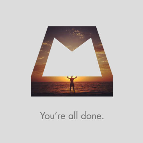
- When you’ve cleared your inbox each day, you get a beautiful, relaxing image that is different every day. It’s a nice little touch that feels like a little "reward" each time you hit inbox zero.
- Changing send-from address popup is easier to use than Apple Mail. It’s a list of email addresses to pick from that requires a simple tap instead of a swipe and a tap like Apple’s wheel selector does. I imagine Apple’s solution works better for those who have a ton of addresses, but I only have 3 I actively check so it’s a nice change.
- Threading of messages is handled really elegantly. Gone are the days of tapping into a thread on Apple Mail and then choosing which message you want to see. Instead, messages all load inline and appear collapsed and greyed out if they’re already read (much like Gmail’s web interface)
- Inline/focused replies. I find the design of the reply/new message box to be limiting in a really good way. Because the box doesn’t give me the entire screen to write a lengthy response, my emails are becoming shorter and more to the point.
- Tasteful use of gestures. There’s a lot of debate about whether or not Clear’s UX is ideal, but I love it. Mailbox’s gestures are built around very quick/easy actions for each email: archive (short swipe right), view later (short swipe left), add to list (long swipe left), and delete (long swipe right). These have been really easy to pick up and the UI does a great job of making sure you don’t make any mistakes and accidentally delete things when you wanted to archive them.
And my least favorite parts:
- Can’t change reply-from address like you can in Apple Mail (I do this a lot for mail that people send to my Cornell or Shelby addresses that I want to be directed to my Gmail account).
- No easy way to find/search filters in Gmail. At this point I don’t really find myself missing this a ton, but it’d be a nice to have.
- Push notifications are a bit wonky. If you have filters in Gmail which are set up to move mail out of your inbox, Mailbox may still badge the app that you have mail. This “false positive" can be a little frustrating especially if you’re compulsive about keeping notifications to a minimum on iOS, but I imagine it will get better with time. This is likely one of the reasons they’re letting people into the app on a rolling basis.
- No iPad experience. Desktop Gmail works pretty well in conjunction with Mailbox, but I’ve found managing email on my iPad just isn’t fun anymore. Gimme that iPad app!
Well, that’s about it - not sure how helpful/comprehensive this review is, but hopefully it’s useful to those that are wondering whether Mailbox is worth the wait (I think it is)!
Comments